
坐标轴最小和值
为了在图表上显示特定区域,可以手动设置坐标轴的最小值和值。
    from openpyxl import Workbook
    from openpyxl.chart import (
        ScatterChart,
        Reference,
        Series,
    )

    wb = Workbook()
    ws = wb.active

    ws.append(['X', '1/X'])
    for x in range(-10, 11):
        if x:
            ws.append([x, 1.0 / x])

    chart1 = ScatterChart()
    chart1.title = "Full Axes"
    chart1.x_axis.title = 'x'
    chart1.y_axis.title = '1/x'
    chart1.legend = None

    chart2 = ScatterChart()
    chart2.title = "Clipped Axes"
    chart2.x_axis.title = 'x'
    chart2.y_axis.title = '1/x'
    chart2.legend = None

    chart2.x_axis.scaling.min = 0
    chart2.y_axis.scaling.min = 0
    chart2.x_axis.scaling.max = 11
    chart2.y_axis.scaling.max = 1.5

    x = Reference(ws, min_col=1, min_row=2, max_row=22)
    y = Reference(ws, min_col=2, min_row=2, max_row=22)
    s = Series(y, xvalues=x)
    chart1.append(s)
    chart2.append(s)

    ws.add_chart(chart1, "C1")
    ws.add_chart(chart2, "C15")

    wb.save("minmax.xlsx")

在某些情况下,如上面代码所示,设置坐标轴范围实际上等同于显示数据的子范围。对于大型数据集,使用Excel或者Open/Libre Office来绘制散点图(可能还有其他)时,选择数据子集方式要比设置坐标轴范围的速度更快。
对数缩放
x轴和y轴都可以对数缩放。对数的基可以设置为任何有效的浮点。如果x轴按对数缩放,则将丢弃区域中的负值。
    from openpyxl import Workbook
    from openpyxl.chart import (
        ScatterChart,
        Reference,
        Series,
    )
    import math

    wb = Workbook()
    ws = wb.active

    ws.append(['X', 'Gaussian'])
    for i, x in enumerate(range(-10, 11)):
        ws.append([x, "=EXP(-(($A${row}/6)^2))".format(row = i + 2)])

    chart1 = ScatterChart()
    chart1.title = "No Scaling"
    chart1.x_axis.title = 'x'
    chart1.y_axis.title = 'y'
    chart1.legend = None

    chart2 = ScatterChart()
    chart2.title = "X Log Scale"
    chart2.x_axis.title = 'x (log10)'
    chart2.y_axis.title = 'y'
    chart2.legend = None
    chart2.x_axis.scaling.logBase = 10

    chart3 = ScatterChart()
    chart3.title = "Y Log Scale"
    chart3.x_axis.title = 'x'
    chart3.y_axis.title = 'y (log10)'
    chart3.legend = None
    chart3.y_axis.scaling.logBase = 10

    chart4 = ScatterChart()
    chart4.title = "Both Log Scale"
    chart4.x_axis.title = 'x (log10)'
    chart4.y_axis.title = 'y (log10)'
    chart4.legend = None
    chart4.x_axis.scaling.logBase = 10
    chart4.y_axis.scaling.logBase = 10

    chart5 = ScatterChart()
    chart5.title = "Log Scale Base e"
    chart5.x_axis.title = 'x (ln)'
    chart5.y_axis.title = 'y (ln)'
    chart5.legend = None
    chart5.x_axis.scaling.logBase = math.e
    chart5.y_axis.scaling.logBase = math.e

    x = Reference(ws, min_col=1, min_row=2, max_row=22)
    y = Reference(ws, min_col=2, min_row=2, max_row=22)
    s = Series(y, xvalues=x)
    chart1.append(s)
    chart2.append(s)
    chart3.append(s)
    chart4.append(s)
    chart5.append(s)

    ws.add_chart(chart1, "C1")
    ws.add_chart(chart2, "I1")
    ws.add_chart(chart3, "C15")
    ws.add_chart(chart4, "I15")
    ws.add_chart(chart5, "F30")

    wb.save("log.xlsx")
这将生成五个类似的图表:
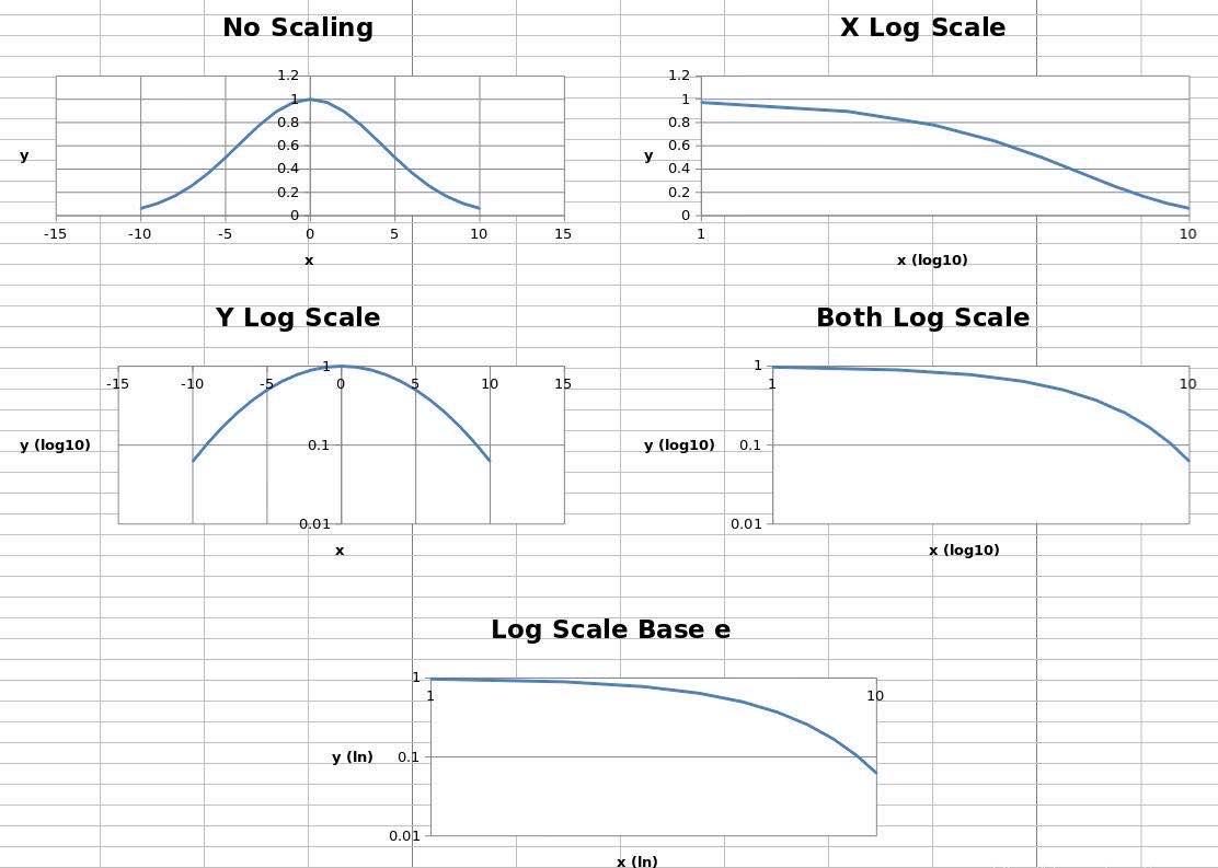
五张图使用了相同的数据。其中,第一个图未缩放,第二和三张图分别缩放了X和Y轴,第四张图XY轴均进行了缩放,对数基数设置为10;最后的图表XY轴均进行了缩放,但对数的底设置为e。
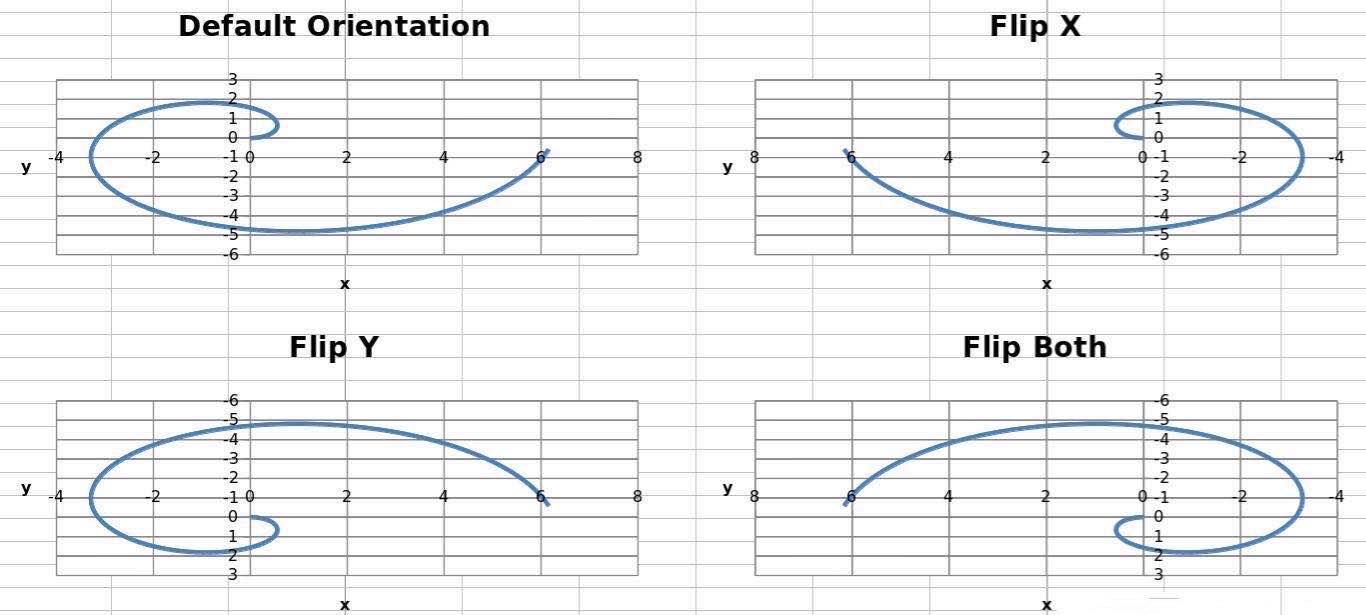
轴线方向
坐标轴可以正常显示,也可以反向显示。
轴方向由orientation属性控制,minMax表示正向,maxMin表示反向。
    from openpyxl import Workbook
    from openpyxl.chart import (
        ScatterChart,
        Reference,
        Series,
    )

    wb = Workbook()
    ws = wb.active

    ws["A1"] = "Archimedean Spiral"
    ws.append(["T", "X", "Y"])
    for i, t in enumerate(range(100)):
        ws.append([t / 16.0, "=$A${row}*COS($A${row})".format(row = i + 3),
                             "=$A${row}*SIN($A${row})".format(row = i + 3)])

    chart1 = ScatterChart()
    chart1.title = "Default Orientation"
    chart1.x_axis.title = 'x'
    chart1.y_axis.title = 'y'
    chart1.legend = None

    chart2 = ScatterChart()
    chart2.title = "Flip X"
    chart2.x_axis.title = 'x'
    chart2.y_axis.title = 'y'
    chart2.legend = None
    chart2.x_axis.scaling.orientation = "maxMin"
    chart2.y_axis.scaling.orientation = "minMax"

    chart3 = ScatterChart()
    chart3.title = "Flip Y"
    chart3.x_axis.title = 'x'
    chart3.y_axis.title = 'y'
    chart3.legend = None
    chart3.x_axis.scaling.orientation = "minMax"
    chart3.y_axis.scaling.orientation = "maxMin"

    chart4 = ScatterChart()
    chart4.title = "Flip Both"
    chart4.x_axis.title = 'x'
    chart4.y_axis.title = 'y'
    chart4.legend = None
    chart4.x_axis.scaling.orientation = "maxMin"
    chart4.y_axis.scaling.orientation = "maxMin"

    x = Reference(ws, min_col=2, min_row=2, max_row=102)
    y = Reference(ws, min_col=3, min_row=2, max_row=102)
    s = Series(y, xvalues=x)
    chart1.append(s)
    chart2.append(s)
    chart3.append(s)
    chart4.append(s)

    ws.add_chart(chart1, "D1")
    ws.add_chart(chart2, "J1")
    ws.add_chart(chart3, "D15")
    ws.add_chart(chart4, "J15")

    wb.save("orientation.xlsx")
这将生成四个图表,其中每个可能的方向组合的轴如下所示:
小伙伴们可以根据自己的需求,生成不同的图表~如需了解更多python实用知识,点击进入PyThon学习网教学中心。


